In the second addition of our series on clever mapping with GDELT data (see this post from last week), we wanted to take on some more advanced mapping techniques. Again, we welcome Kalev H. Leetaru of the GDELT Project to explain how using geospatial information about journalism can build a better understanding of media in our world! Read on for more!
Customized Data Feeds via the GDELT API
While the Geographic News Search tool we explored last time is great, it can also be limiting. You can’t customize the look-and-feel. The clickable layer only displays the last hour of news coverage and you can only display one query at a time. That’s where the GDELT API comes into play!
We’ve created a powerful new API that lets you take your query and get back a GeoJSON stream of matching coverage, exposed as a normal HTTP URL that you can paste into CartoDB and import as a new table! If your CartoDB account has “sync tables” enabled (John Snow or greater and all education accounts), then just click on “sync every hour” when you create your new table and CartoDB will automatically download the latest updates from the API every hour and refresh your table. You get a live-updating map automagically!
Using the API, you can create as many customized GDELT feeds as you want, focusing on people, organizations, GDELT Themes, news outlets, languages, or any combination therein. Each feed becomes its own CartoDB table, ready for you to make rich interactive maps!
We’ve laid out a step-by-step tutorial that walks you through every mouse click needed to use the API and create a new clickable and animated map from GDELT! In just 5-10 minutes you can have your first map ready!
The map below, which the tutorial walks you through creating, shows global coverage of major kinds of unrest - from military attacks to stonethrowing, covering the last 24 hours. Check out the tutorial now!
If you’re feeling particularly adventurous, read up on the full documentation for the GDELT API, especially the section on the “GCAMVAR” – this allows you to include any of the thousands of emotions that GDELT assesses from each article using the GDELT Global Content Analysis Measures system, which applies 24 of the major sentiment analysis packages! Imagine the possibilities in creating breathtakingly detailed real time maps of global emotions!
Advanced GDELT Mapping Using Google BigQuery
For those comfortable writing SQL, Google houses a copy of GDELT in its BigQuery database platform that you can use to create some truly awesome maps that span multiple months or involve extremely complex queries. Just sign up for a Google Big Query account and start experimenting!
Plot Media Output
For inspiration, the heatmap below was created by Felipe Hoffa, Developer Advocate on big data at Google, meant to visualize a day in the life of the global news media via GDELT using Google BigQuery and CartoDB. The map plots all worldwide locations mentioned in a single day of global news coverage monitored by GDELT, using the copy of GDELT linked above.
In his Reddit post, Felipe walks through the process he used to create the map, including his BigQuery SQL, a re:dash interface, and the streamlined process of importing into CartoDB using the new “oneclick” interface. You’ll notice that this map closely matches global population density estimates for 2015, especially when clustering metro areas into their centroid points as GDELT does.
Compare News Sources
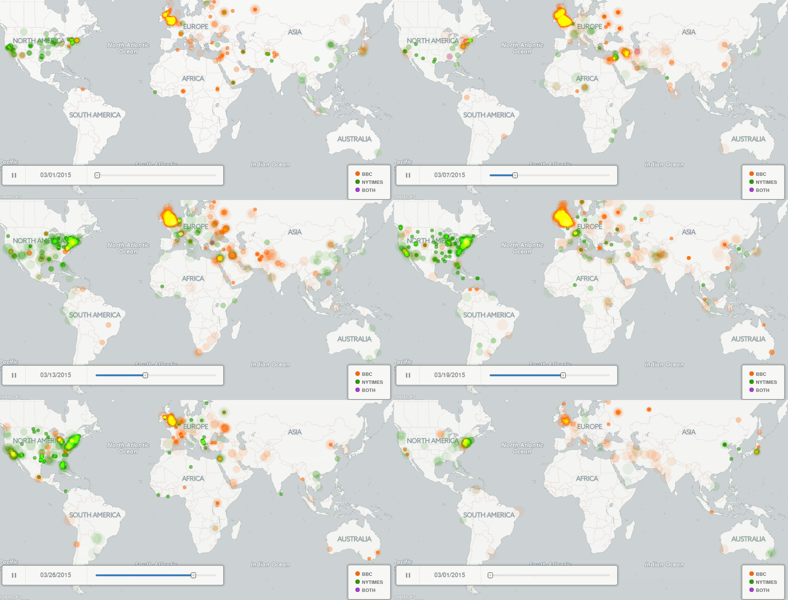
The gif below shows another map built using BigQuery – this time comparing the geographic coverage of the BBC (orange) and New York Times (green) over the month of March 2015 in 15 minute increments and rendered using Torque. To learn more about how this map was made see the blog post about it or the “Mapping a Week in the Life of the World’s News Media” post that it was based on, which includes all of the source code to make this map.

Track a Media Outlet
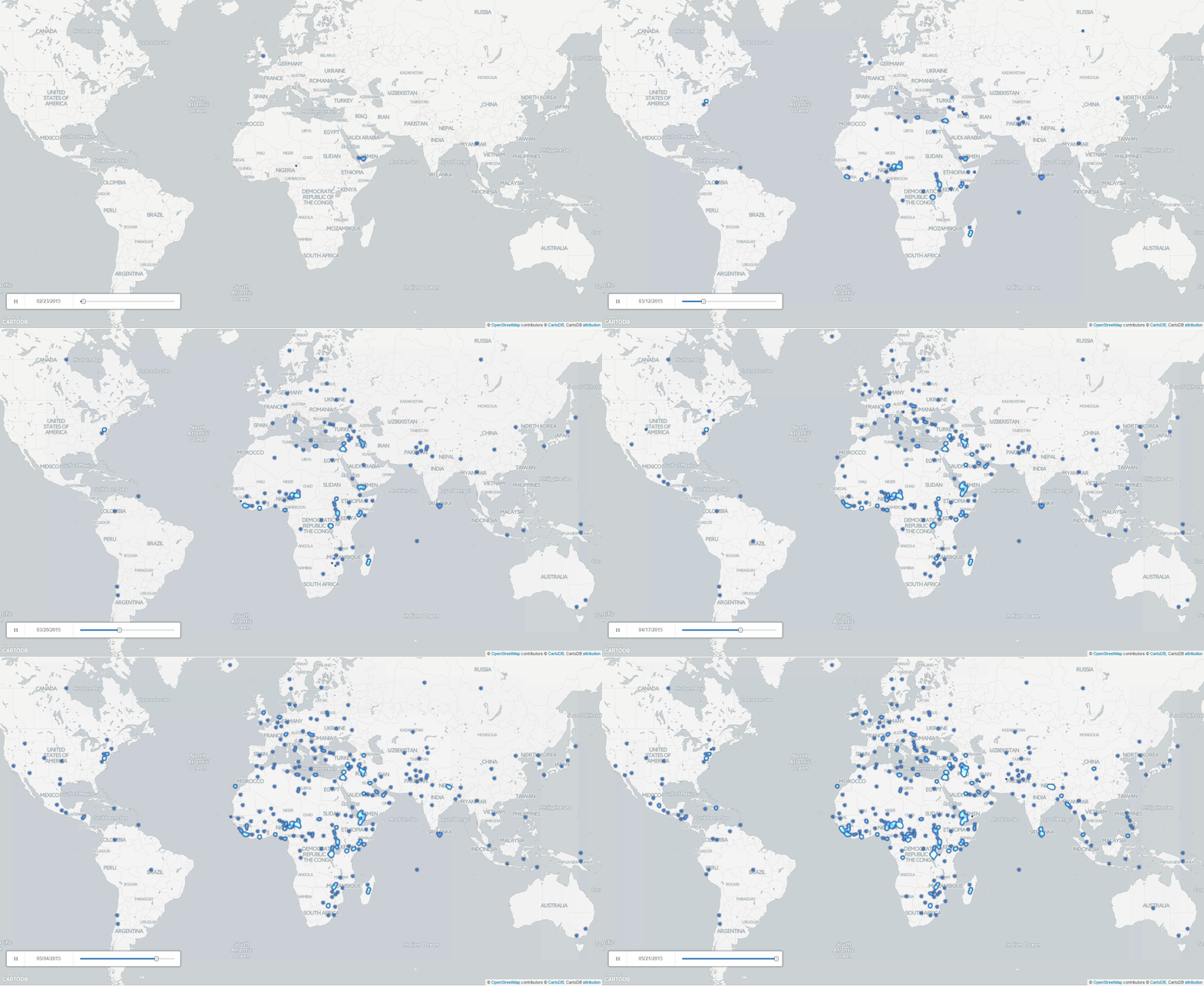
Likewise, the gif below shows the same approach used with the “Cumulative” option in Torque to create a cumulative map of the geographic focus of IRIN’s news coverage over the last three months, showing how with a single line of SQL, a few lines of PERL, and CartoDB, you can quite literally map the geography of a news outlet over time!

Model Topics and Stories
With a little extra work, you can even incorporate GDELT’s Automatic Source Location Georeferencing datasets, which exist for both English and non-English news outlets, estimating their country-level geographic location. Using this data, you can map how the media of each country portray different topics!
Using the GDELT Event Database, you can combine the event and narrative datasets in GDELT to produce truly incredible visuals of the world’s activity and discourse. Featured as the CartoDB Map of the Week for August 18, 2014 and supported by the US Institute of Peace, the GDELT Global Conflict Dashboard map below shows a cross-section of global protests and conflicts. Learn more about how the map was created or download the code to make your own version using the CartoDB SQL API! Creating a map like this, especially with the live SQL API updating and use of multiple scripts and programming, to combine and filter everything means this is a non-trivial coding effort. This example provides a template for extremely sophisticated use of GDELT that blends data feeds in highly innovative ways.
Map Issues of Interest
Finally, our eco-enthusiasmisstrong at CartoDB, and we would be remiss if not to mention how GDELT can be used to study wildlife preservation issues globally. Want to learn how to track a poacher with media posts, or tease out how terrorism syncs with poaching practice globally? Check out the Wildlife Crime Report map below, learn about its making in this blogpost, and read the feature on Foreign Policy, “Can you use big data to track an elephant poacher?”.
Two other maps track the discussion around drones and cyberattacks in the popular media globally. A “making of” blogpost walks step-by-step through the creation of all three maps.
We hope all of these examples have inspired you and that you’re as excited about this new dataset as we are! Please email Kalev Leetaru at the GDELT Project if you have a map you’re particularly proud of. He might even feature it on the GDELT Blog!
Stay tuned for more on the GDELT front, and happy mapping!